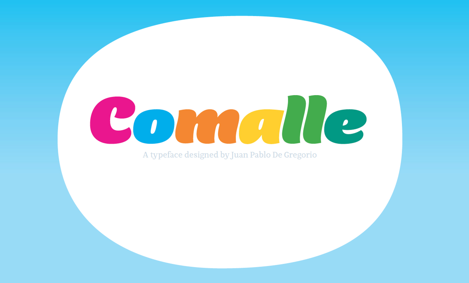
Comalle, es una tipografía que de alguna manera rinde un pequeño homenaje a la teoría de la Gestalt, ese libro que nos obligaron a leer en primer año y que hablaba de la percepción psicológica de los elementos y estaba repleto de apasionantes juegos visuales de formas, texturas y colores.
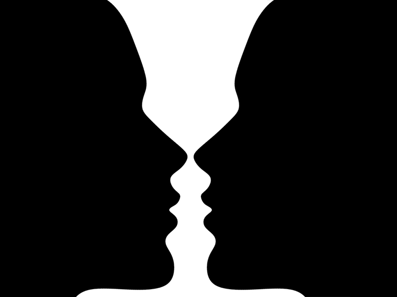
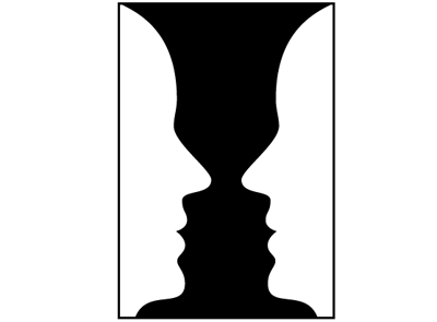
Recordaremos ese famoso ejemplo donde puedes ver dos siluetas caras de personas si ves la figura, pero si te fijas en el fondo, aparecerá milagrosamente una copa.
Bajo ese mismo principio de utilizar formas y contraformas muy reconocibles se estructura el concepto de Comalle.
A la hora de diseñar una fuente, podemos suponer que una tipografía de trazo muy delgado, tendrá contraformas amplias y abiertas, tan abiertas, que muchas veces se pierden en un infinito mar de blanco.
Como Comalle tiene un trazo más bien grueso, permite trabajar con acotadas formas en negativo, que van abriendo paso al trazo mismo, tranzando de igual a igual el espacio tanto negro como blanco.
Entendiendo a Comalle
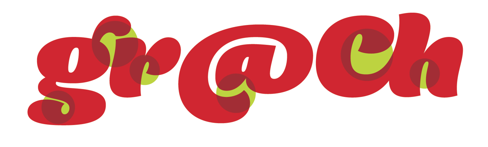
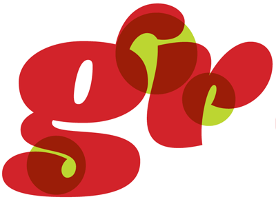
Si miramos el ejemplo superior, podemos apreciar cómo el juguetón peinado de la g, recibe fascinado a la letra que le sigue, creando un interesante espacio entre las dos letras que, incluso sin juntarse y funcionando independientemente bien, crean un lúdico espacio virtual.
Lo mismo pasa con la cola de la “g”, en la que el blanco externo entra muy tímidamente y termina esculpiendo con decisión la forma. La idea del trabajo de Comalle entonces, no es sólo pensar las contraformas internas de los caracteres, sino que intentar también integrar al vecino.
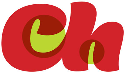
Existen caracteres que se prestan voluntariamente para delicados detalles en este juego de formas sólidas y su contraforma, como la arroba, en que es envuelta por si misma, rematando de una manera muy curiosa, citándose a si misma para proponer un dibujo distinto.
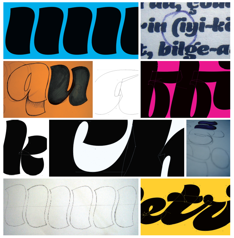
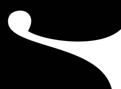
Hace algunos meses, hablábamos de la importancia del juego de velocidades en el trazado de las curvas en la tipografía. Comalle aprovecha al máximo ese delicioso juego de velocidades, creando un especial juego de intensidades de curva, muy coherente entre si, en el que prácticamente el capricho en su diseño está totalmente ausente. Estas curvas son trazadas cada una de manera muy natural y traducidas a bellos trazos.
En fin, la opción de trabajar con simpleza la complejidad de la curva y contracurva orgánica, es la gran apuesta de Comalle, una tipografía que su forma parece trazada por un hábil letrerista y su contraforma fue moldeada por un habilidoso cirujano y su bisturí.
En fin, Comalle está a la venta en Veer, y aquí pueden disfrutar de su especímen y continuar entendiendo el juego de formas de esta alegre y primaveral tipografía.
Por cierto, si quieren usarla para algún proyecto específico, pueden adquirirla acá.
Comalle, es una tipografía exclusiva para la colección Latinotype, de Myfonts.
Good info. Do you’ve got a subsciber lists? Quality stuff. Thanks. Keep up to date the coffee quality posts.
Appreciation for your great short article. I’m glad I have taken any time to learn this.
I simply want to mention I am just very new to blogs and truly savored this website. Almost certainly I’m going to bookmark your site . You surely have perfect article content. Thanks a bunch for sharing your web-site.
This is a great information it can help me, thanks for sharing
Amo some sort of Comalle, amo sus curvas. Necesito alguna pista, algún consejo sobre el trazo de curvas brown naturales ymca scam esos aceleramientos que generan placeres brown exquisitos. Sé que es cuestión de practica, pero debe haber por ahí alguna pista que puedas compartir. ¡Saludos desde México! Jasho.Web Design Devon
I would like to thank you for the efforts you have made in writing this article. I am hoping the same best work from you in the future as well. In fact your creative writing abilitie
iphone 5 vs iphone 6
I like this post very much, You have defined it very simply for so I understand what you say, In this post your writing level is also excellent to us.This is great issue you have done on this topic really very well.
clipping path
I hope to provide something again and aid others like you helped me.
Fantastic beat ! I wish to apprentice while you amend your web site, how could i subscribe for a blog site? The account helped me a acceptable deal. I had been tiny bit acquainted of this your broadcast offered bright clear concept
I donat think Iave never learned something like this before. So nice to find someone with some authentic ideas on this subject. I really thank you for beginning it. This web site is one thing thatas needed on the net, someone with a little originality.
Your positions constantly include a lot of really up to date info. Where do you come up with this? Just stating you are very resourceful. Thanks again
I am not sure where you are getting your information, but good topic. I needs to spend some time learning much more or understanding more. Thanks for wonderful information I was looking for this information for my mission.
This is such a great resource that you are providing and you give it away for free. I love seeing websites that understand the value of providing a quality resource for free.
Very nice and helpful information has been given in this article. I like the way you explain the things. Keep posting. Thanks.. forex tips
There is lot of articles on the web about this. But I like yours more, although i found one that’s more descriptive. free stock tips
Stephen Stapinski
Really your blog is very interesting…. it contains great and unique information. I enjoyed to visiting your blog. It’s just amazing…. Thanks very much for the share.
Thank you! I always wanted to write in my site something like that. Can I take part of your post to my blog?
I really enjoyed reading it, you are a brilliant writer.
good news about internet uses .i really thanks for nice post sharing .
The hard part if producing content on regular basis and editing them
This is the first time i am reading your post and admire that you posted article
I wanted to thank you for this great article.
nice Post,Good work…unique site and interesting too
This is the perfect blog for anyone who wants to know about this topic. The article is nice and it’s pleasant to read. I have known very important things over here
good stuff regarding trading of stock.your market outlook blog was too good.
what a entire blog work flow..
I`m so grateful that you enlightened me and the most important thing that it happened in time. Just think, I have been using the internet for six years already but it`s the first time I`ve ever heard about it!….
This article truly impressed me. Absolutely love your blog and find most of your post’s to be just what I’m looking for. Awesome! Thanks
Thanks for posting this informative article. I haven’t any word to appreciate this post.Really i am impressed from this post. The person who creates this post it was a great human. Thanks for shared this with us.
Fantastic article, well written and extremely useful, thanks. This information is great to me. Thank you guys for your awesome posts. I have been looking for this for a while.
Excelente artículo, me ha encantado la modificación a la tipografía!
Normalmente uso un sistema de librería-adminitrador de fuentes que trae 16.000 tipografías, se llama ExaFONT y es gratis.
http://fitusmaximus.blogspot.com
Disfruta de una Sprite, Las cosas como son http://bit.ly/GraffitiSprite
Hola =D
Me llamo Sara, soy estudiante de Diseño Grafico en México y me fascina su blog, estoy aprendiendo muchas cosas.
Me dejaron una tarea en q debo crear una tipografia para un libro titulado “Un sueño en coma”, hice varias propuestas pero a mi profesora no le agradaron, algun consejo que pueda darme?
Por favor ='(
This is all about magic. This magic is comes to any kind of aching or pain. How easy it is to manage the posts and other things? This really great.
I consider everyone must read this.
Excelentes consejos, espectaculares diseños!
Gracias por difundir.
Nice information, many thanks to the author. It is incomprehensible to me now, but in general, the usefulness and significance is overwhelming. Thanks again and good luck!
Preciosa tipografía…
Me encanta. Me recuerda bastante a la tipografía Mercurius, aunque Comalle parece que todavía está mejor diseñada. Qué bonita es.
me interesa esta tipografia, intente con la tarjeta de credito pero no me funciono la operacion, hay algun otro enlace donde se pueda comprar??
saludos!!
Estupendísima!!!
De buena que es, entran hasta ganas de comer!!!
Habrá que busca esta fuente
Amo a Comalle, amo sus curvas. Necesito alguna pista, algún consejo sobre el trazo de curvas tan naturales y con esos aceleramientos que generan placeres tan exquisitos. Sé que es cuestión de practica, pero debe haber por ahí alguna pista que puedas compartir. ¡Saludos desde México! Jasho
Felicidades por el blog.. Interesante!!
Me encantan todas las imágenes que has colocado para representar gráficamente los escrito, es estupendo!
Saludos desde España!
Que letra más bonita, es alegre y simpática, preciosa.
Acabo de ver Comalle y tu nombre publicados en Ilovetypography.com. te felicito!
Salud{os}!
M.
hermosa tipo!
dan ganas de salir a comer helado!
suerte.
me gusta que queden como empastadas 🙂
Me encanta la Comalle. Está compensada, equilibrada y es muy legible aunque se trate de una fuente más bien decorativa. Un gran trabajo. Espero próximos posts. Quiero más.
Un saludo desde España.
Okoite este letra, saludos desde Asunción..
Si estas interesado en intercambiar enlaces ingresa en:
http://d-moz.com
Informacion para subir y promosionar webs en buscadores
Intercambios de enlaces de texto y links en forma reciproca para aumentar el numero de visitas
http://tus-links.netfirms.com
Una tipografía super graciosa y agradable. Me gusta mucho.
Hola soy del blog Extremisimo.com y te invito a un concurso que estamos haciendo. Diseña un logo, gana un banner y dinero por paypal en DOLARES. http://extremisimo.com/?p=3064 <- entra
Hola Juan Pablo,
perdona el offtopic, pero encontré este video, y me acordé de Letritas!
¿Dejarías entrar a Zapf Dingbats a una conferencia Tipográfica?
http://www.collegehumor.com/video:1823766
Jaja, está genial la gordita comalle. me gustaron mucho las lineas y las terminaciones, excelente.
PD: romeral la “prestaste” para tipos unidos?, cuando vi las tipos incluidas la vi y me acorde de este blog. Va a estar re bueno ese cedé, asi q creo que lo compraré.
Eres un gran tipógrafo, ojalá sigas asi.
Excelente,
cuando te das cuenta que una tipografía es tan bella, es que el diseño ya te tiene bien loco, y eso es muy bueno…
continúa así, JP!
Saludos!!!
y un abrazote!!!!
UFFF!!
Me fascinó Comalle!! Es muy, muy linda!!
Felicitaciones 🙂
Encantadora la letra, interesantísimo el artículo (como todos)
Felicidades!!
Grande JP!!!!
un abrazo!
Tito